

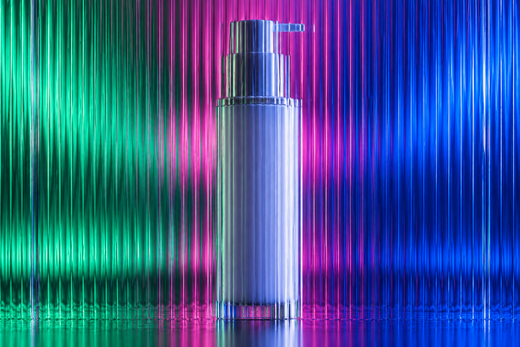




A cosmetic bottle and its carton should look related, but copying the same artwork at a different size usually misses their different jobs. The carton may explain the offer before purchase; the bottle needs to remain identifiable in everyday use after that carton is gone.
Identify the minimum shared cues
Choose the brand position, product name relationship and a controlled visual detail that can survive both formats. A hypothetical facial oil might use a tall carton and a short bottle label. Keep the recognisable relationship, but reorganise secondary material rather than squeezing the entire carton face onto the bottle.
Compare real materials
Board, clear labels and coloured bottles can change the appearance of the same colour specification. Ask suppliers how colours will be reproduced and what samples are available. Do not promise a perfect match from screen values alone. Review the components together under agreed conditions before accepting the final visual relationship.
Keep the product identity intact
Check that names, variant wording and capacity agree across the components and ecommerce images. Have the responsible business confirm the information required on each.
Studio perspective
The studio recommendation is a paired review board containing both surfaces and a full-size bottle mockup, not separate approvals weeks apart.
Practical review checklist
- Shared recognition cues
- Independent format layouts
- Material samples compared
- Matching product data
Related design decisions
For the wider project, read Cosmetic Packaging Mockups: How 3D Renders Help Before Printing and Luxury Cosmetic Label Design Without Making the Pack Confusing.
Frequently asked questions
Should the carton carry more information?
It may have more space, but applicable requirements for each component need separate review.
Can the same colour values guarantee a match?
No; substrates and production processes matter.
When should renders be made?
Once both component artworks are sufficiently approved to avoid presenting mismatched versions.
Plan the next step
Explore Y NOT TONY’s cosmetic packaging design service and view the Keratin Revolution project for a published example of the studio’s work. The examples described in this guide are illustrative, not reported client outcomes.
Ready to scope a project? Request a project quote with the formats, variants, available files and intended launch date.