
01
Project overview
Case study / Alcohol
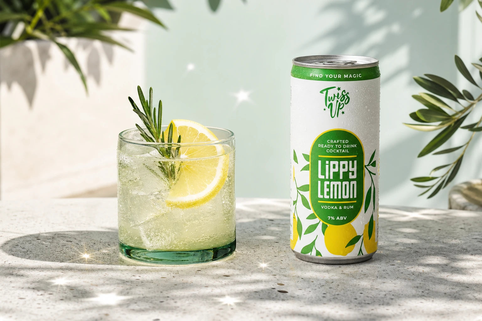
Brand Identity, Ready-to-Drink Cocktail Can Packaging, Three-SKU Range, 3D Product Visualisation, Campaign Art Direction for Twiss Up.
01
Project overview
02
03

Design priorities
Build a recognisable visual idea that gives the project its own clear point of view.
Organise the message so the audience can understand the product quickly and confidently.
Create a flexible system that stays coherent wherever the brand needs to appear.


Creative direction

Featured scope
Created for Twiss Up. Designed by Tony Musso.


Project questions
Practical details about Twiss Up Ready-to-Drink Cocktail Packaging, the design scope and working with YNOT TONY on a related project.
The Twiss Up Ready-to-Drink Cocktail Packaging case study presents Brand Identity, Ready-to-Drink Cocktail Can Packaging, Three-SKU Range, 3D Product Visualisation, Campaign Art Direction created for Twiss Up. It records the project scope, creative direction and selected visual outcomes.
Twiss Up Ready-to-Drink Cocktail Packaging is recorded as a CLIENT PROJECT | COCKTAIL PACKAGING | CAN DESIGN | 3D VISUALS | CAMPAIGN project. The documented scope is Brand Identity, Ready-to-Drink Cocktail Can Packaging, Three-SKU Range, 3D Product Visualisation, Campaign Art Direction, brought together as a clear and coherent design system.
Twiss Up Ready-to-Drink Cocktail Packaging credits Tony Musso as the designer. The work is presented by YNOT TONY, a UK-based packaging, brand and graphic design studio led by Tony Musso.
The recorded services for Twiss Up Ready-to-Drink Cocktail Packaging are Brand Identity, Ready-to-Drink Cocktail Can Packaging, Three-SKU Range, 3D Product Visualisation, Campaign Art Direction. The case study shows how these elements work together to create one recognisable visual direction.
Yes. YNOT TONY is a UK-based packaging, brand and graphic designer with more than 20 years of experience, available for remote projects across the UK, Europe, the USA, Australia and worldwide. A brief can begin with the product, audience, format, SKU count, timing and production requirements.
A useful brief covers the product, target audience, pack or label format, number of variants, required claims and information, production stage, launch timing and available brand assets. YNOT TONY can then define the appropriate design scope and next steps.
Planning a alcohol design project?