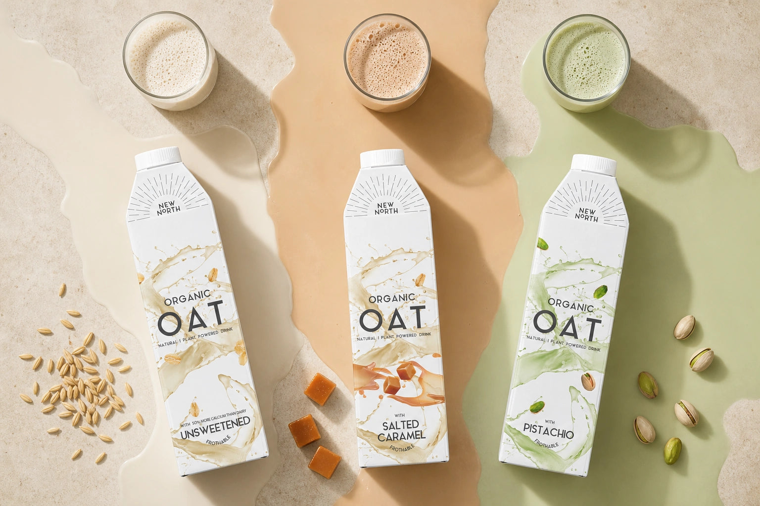
Packaging Design, Flavour Range Architecture, Tetra Pak Carton Design, Product Visualisation, 3D Rendering for New North.
Category
Food & Drink
Scope
Packaging Design, Flavour Range Architecture, Tetra Pak Carton Design, Product Visualisation, 3D Rendering
Focus
Oat milk packaging design
01
Project overview
A clear idea, brought to life with purpose.
02
About the project
Oat milk Tetra Pak packaging for New North by Tony Musso, extending the brand into Salted Caramel and Pistachio with a cohesive flavour system.
03
The design response
New North approached me after establishing its standard oat milk and preparing to expand into a new flavoured range. The packaging brief was to create Salted Caramel and Pistachio variants that felt exciting and distinctive, while retaining enough of the original product's visual equity for customers to recognise the brand immediately.
The design develops a clear range architecture for the tall Tetra Pak carton. The New North wordmark and radiating line device sit high on the pack, creating a consistent brand signature with strong shelf visibility. Large OAT typography anchors the centre, so the product category remains unmistakable even as each flavour introduces its own personality.
Fluid oat-milk splashes wrap around the cartons and create energy across the range. The Unsweetened design uses natural cream and oat tones to communicate simplicity. Salted Caramel introduces warm golden-brown colour and caramel pieces for a richer, more indulgent expression. Pistachio uses a fresh green-tinted splash with illustrated nuts, giving the flavour an immediate visual cue without disrupting the overall system.
Product descriptors, flavour names and the frothable message are organised into a consistent hierarchy near the lower section of each pack. This gives shoppers a quick route from brand to product type to flavour, while maintaining the restrained, premium appearance of the original oat milk.
The final packaging system gives New North a flexible foundation for future plant-based drink extensions. Each carton works as an individual product, but the repeated composition, typography and splash language make the three variants feel like one confident family. Realistic product visualisation helped review the range together and demonstrate how the designs would perform across retail, e-commerce and launch communications.
Design priorities
Built to stand out. Structured to stay clear.
01
Distinctive identity
Build a recognisable visual idea that gives the project its own clear point of view.
02
Clear communication
Organise the message so the audience can understand the product quickly and confidently.
03
Designed for context
Create a flexible system that stays coherent wherever the brand needs to appear.
01/03
Swipe
Design priority 1 of 3
Creative direction
A distinctive idea designed to work everywhere.
New North needed an oat milk packaging system that could introduce new flavours without losing the clean, contemporary character of its established product. The range architecture retains the generous white space, central wordmark and bold OAT typography, then uses expressive liquid splashes and ingredient cues to distinguish each recipe.
Soft oat tones support the Unsweetened carton, warm caramel creates an indulgent Salted Caramel variant, and fresh pistachio green gives the nut-flavoured product immediate recognition while keeping all three packs unmistakably New North.
Featured scope
The work behind the project.
↗
CLIENT PROJECT
↗
OAT MILK PACKAGING
↗
TETRA PAK DESIGN
↗
3D VISUALS
Created for New North. Designed by Tony Musso.
Project questions
Frequently asked questions
Practical details about New North Oat Milk Tetra Pak Packaging Design, the design scope and working with YNOT TONY on a related project.
What is the New North Oat Milk Tetra Pak Packaging Design case study?
The New North Oat Milk Tetra Pak Packaging Design case study presents Packaging Design, Flavour Range Architecture, Tetra Pak Carton Design, Product Visualisation, 3D Rendering created for New North. It records the project scope, creative direction and selected visual outcomes.
What type of design project was created for New North?
New North Oat Milk Tetra Pak Packaging Design is recorded as a CLIENT PROJECT | OAT MILK PACKAGING | TETRA PAK DESIGN | 3D VISUALS project. The documented scope is Packaging Design, Flavour Range Architecture, Tetra Pak Carton Design, Product Visualisation, 3D Rendering, brought together as a clear and coherent design system.
Who designed New North Oat Milk Tetra Pak Packaging Design?
New North Oat Milk Tetra Pak Packaging Design credits Tony Musso as the designer. The work is presented by YNOT TONY, a UK-based packaging, brand and graphic design studio led by Tony Musso.
Which design services were included in New North Oat Milk Tetra Pak Packaging Design?
The recorded services for New North Oat Milk Tetra Pak Packaging Design are Packaging Design, Flavour Range Architecture, Tetra Pak Carton Design, Product Visualisation, 3D Rendering. The case study shows how these elements work together to create one recognisable visual direction.
Can YNOT TONY create a similar drinks design project remotely?
Yes. YNOT TONY is a UK-based packaging, brand and graphic designer with more than 20 years of experience, available for remote projects across the UK, Europe, the USA, Australia and worldwide. A brief can begin with the product, audience, format, SKU count, timing and production requirements.
What information helps start a similar drinks design project?
A useful brief covers the product, target audience, pack or label format, number of variants, required claims and information, production stage, launch timing and available brand assets. YNOT TONY can then define the appropriate design scope and next steps.
Planning a food & drink design project?
Let’s make the next one unmistakable.
Launching a plant-based drink or extending an existing range? Let’s create packaging that keeps the brand recognisable while giving every flavour a clear identity.