


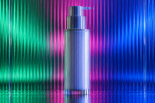


Vitamin packaging has to do two jobs at once: make the product recognisable in a crowded category and make everyday information easy to find. A strong system gives the brand a confident front-of-pack presence, then lets the customer locate the format, product variant and essential directions without hunting through decoration. For UK launches, that clarity is also a practical artwork discipline, not simply a visual preference.
The right starting point is a packaging system, not one attractive tub or carton. Decide what must stay consistent across the range, what changes by product, and which information needs a protected home before the creative work begins. If you are developing a new line, our supplement packaging design service can help turn that thinking into a workable range.
Start with the customer’s quick read
At a glance, a buyer should be able to recognise the master brand, the product type and the variant. That does not mean making every element equally large. It means agreeing an order of importance before choosing colours, finishes or illustration.
- Level one: the brand or range marker that makes products belong together.
- Level two: the product name or nutrient category a shopper uses to choose.
- Level three: the format and pack quantity, placed where it can be found without competing with the range name.
Try the design at its likely decision distance: a small ecommerce thumbnail, a shelf planogram or the customer’s hand. If the variant can only be identified by reading dense copy, the hierarchy has not done enough work.
Choose a format before designing a label
A vitamin line may need bottles, cartons, pouches, sachets or a mix of formats. Each changes the available panels, the way a customer opens the product and the way the product is photographed. A bottle label needs to account for a curved reading surface; a carton provides more planes for navigation; a sachet has very little room, so the front must become especially disciplined.
Map the physical pack early. Ask the supplier for dielines and print specifications, then mark the panels that are genuinely usable before deciding where the key graphic belongs. The packaging dieline guide explains why this step prevents an appealing flat design from becoming an awkward manufactured pack.
Give required information a protected place
Designers should not invent legal copy or treat compliance as an afterthought. In Great Britain, the Food Standards Agency says food supplements must meet general food-labelling requirements and sets out supplement-specific information, including the name food supplement, recommended daily dosage, a warning not to exceed it, storage information, and statements about a varied diet and young children. Read the FSA’s food-supplement guidance with the product owner and regulatory adviser; requirements can depend on the product and where it is sold.
For the packaging designer, the practical lesson is simple: reserve a clear information zone and establish type rules that remain legible when the range grows. Do not make a marketing claim carry the product’s whole identity. The hierarchy should remain useful even after the required copy, ingredients and barcode are in place.
Build a range system that can grow
Colour is useful for navigating a vitamin range, but colour alone is a fragile system. It can break down in low light, on a crowded shelf or for customers who do not distinguish the palette in the same way. Pair colour with a second signal: a simple symbol family, a product code, a clear format label or a repeatable graphic device.
Keep the master brand elements fixed and allocate changeable areas for variant information. This means a future powder, capsule or gummy can still feel like the same family without forcing its own needs into the first product’s layout. For an example of how a product-led visual system can be developed across the wider brand, see the Y Not Tony packaging designer portfolio.
Plan the artwork review, not only the launch render
A clean mock-up is a useful decision tool, but it is not final artwork. Before sign-off, review the supplied dieline, product copy, panel order, barcode space, print process and finishes with the relevant supplier and compliance contacts. Keep a version-controlled copy deck so the words in the approved artwork match the words that were reviewed.
It also helps to test the pack in the places it will actually appear: a Shopify card, an email crop, a retail shelf visual and a close product-detail view. If you need to make that work visual before photography, pair the pack design with 3D product renders rather than relying on a single flat artwork file.
A sensible brief for vitamin packaging
Bring the product format, supplier dieline, product copy, ingredient and allergen information, desired launch channels, range plan and examples of competitors to avoid. Include the people who own legal and commercial approval from the start. That gives the design process a realistic boundary and makes it far less likely that a late copy change will unravel the composition.
If you are ready to scope a range rather than a one-off label, request a packaging design quote. We can review the formats, number of SKUs and launch assets you need.
FAQs
What should come first on vitamin packaging?
Usually the brand or range marker, followed by a clear product identifier. The best order depends on whether customers already know the brand, but a shopper should be able to distinguish the product without reading a dense panel of copy.
Can one visual system work for bottles, cartons and sachets?
Yes, if it is built from flexible ingredients: a stable brand marker, a repeatable grid, sensible colour rules and a variant signal that does not rely only on the pack shape.
Does a packaging designer approve supplement wording?
No. A designer can create a clear place for approved copy, but the product owner should obtain the appropriate regulatory and technical review for the market before print.
Planning a vitamin or wellness range? Explore supplement packaging design or get a packaging design quote.