Case study / Wellness

Mystically Well / SOLARA

Brand Identity, Collagen & Gelatine Packaging Design, Stand-Up Pouch Artwork, 3D Product Visuals for Mystically Well / SOLARA, created in United Kingdom.
Category
Wellness
Scope
Brand Identity, Collagen & Gelatine Packaging Design, Stand-Up Pouch Artwork, 3D Product Visuals
Focus
Collagen packaging design
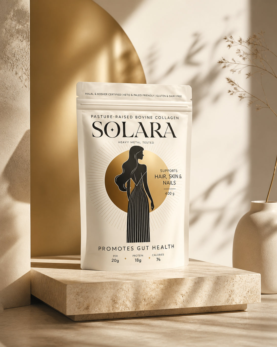
SOLARA pasture-raised bovine collagen pouch packaging design on a travertine pedestal with warm gold sunlight

A clear idea, brought to life with purpose.

01

About the project

The opportunity

Mystically Well founder Maisy Healey had built a large community around ancestral nutrition, skin health and approachable education on bovine gelatine and collagen. With her recipes and educational content reaching more than 60 million people, the next step was a product people could recognise, understand and trust.

The brief was to create the identity and packaging for SOLARA, beginning with a 400g stand-up pouch for pasture-raised bovine collagen and a visual language that could extend naturally to gelatine. The pack needed to feel elevated enough for the beauty and wellness audience while keeping product type, testing, certification and key information clear.

Project scope

The project covered brand identity, typographic direction, front-of-pack hierarchy, custom illustration, the solar graphic system, flexible pouch artwork and realistic 3D product visualisation. The aim was not simply to decorate a supplement pouch, but to create a credible brand world connecting ancestral nourishment with modern transparency.

02

The design response

A distinctive and credible wellness pouchThe completed design gives SOLARA an identity that can be recognised before every line of copy is read. The serif wordmark supplies authority, the solar motif creates emotional meaning, and the clear hierarchy gives product and trust information defined places on the front panel.The white flexible pouch keeps the product feeling pure and direct, while gold and black add enough contrast to hold attention online and on shelf. The result balances the visual codes of...

Built to stand out. Structured to stay clear.

  1. 01

    Distinctive identity

    Build a recognisable visual idea that gives the project its own clear point of view.

  2. 02

    Clear communication

    Organise the message so the audience can understand the product quickly and confidently.

  3. 03

    Designed for context

    Create a flexible system that stays coherent wherever the brand needs to appear.

A distinctive idea designed to work everywhere.

Ancestral symbolism with modern authority

The SOLARA wordmark uses a high-contrast serif style with a small star cut into the first O, giving the name a distinctive celestial signature. A poised female silhouette stands in front of a metallic sun disc, linking the founder's ideas around nourishment, ritual and feminine wellbeing without relying on familiar clinical supplement graphics.

Warm ivory, black and champagne gold create a restrained palette that feels premium but not ornamental. Fine radiating lines introduce light and energy, while the long linear dress gives the central illustration enough vertical presence to anchor the pouch.

Clarity built into the beauty

The front panel follows a deliberate reading order: product type first, SOLARA as the dominant brand asset, testing and benefit information around the central motif, then pack size and nutritional details at the base. Generous spacing prevents the certifications and product messages from competing with the identity.

The same architecture can support collagen and gelatine products while preserving strong brand recognition. Product descriptors and verified information can change by SKU; the wordmark, sun device, illustration style and core proportions remain consistent.

A sun-washed campaign world

The visual direction extends the packaging into warm editorial product photography. Travertine, soft linen, clear water, brass details and late-afternoon shadows echo the palette on pack, creating a calm daily-ritual setting suitable for ecommerce, social launches and brand storytelling.

The work behind the project.

  • CLIENT PROJECT
  • BRAND IDENTITY
  • PACKAGING
  • 3D VISUALS

Created for Mystically Well / SOLARA in United Kingdom. Designed by Tony Musso.

Let’s make the next one unmistakable.

SOLARA shows why wellness packaging has to make trust and desire work together. The design feels aspirational because of the type, illustration and material palette, but it remains useful because every product cue has a clear role. That balance is what turns a beautiful pouch into a brand system people can navigate and remember.

Get a design quote