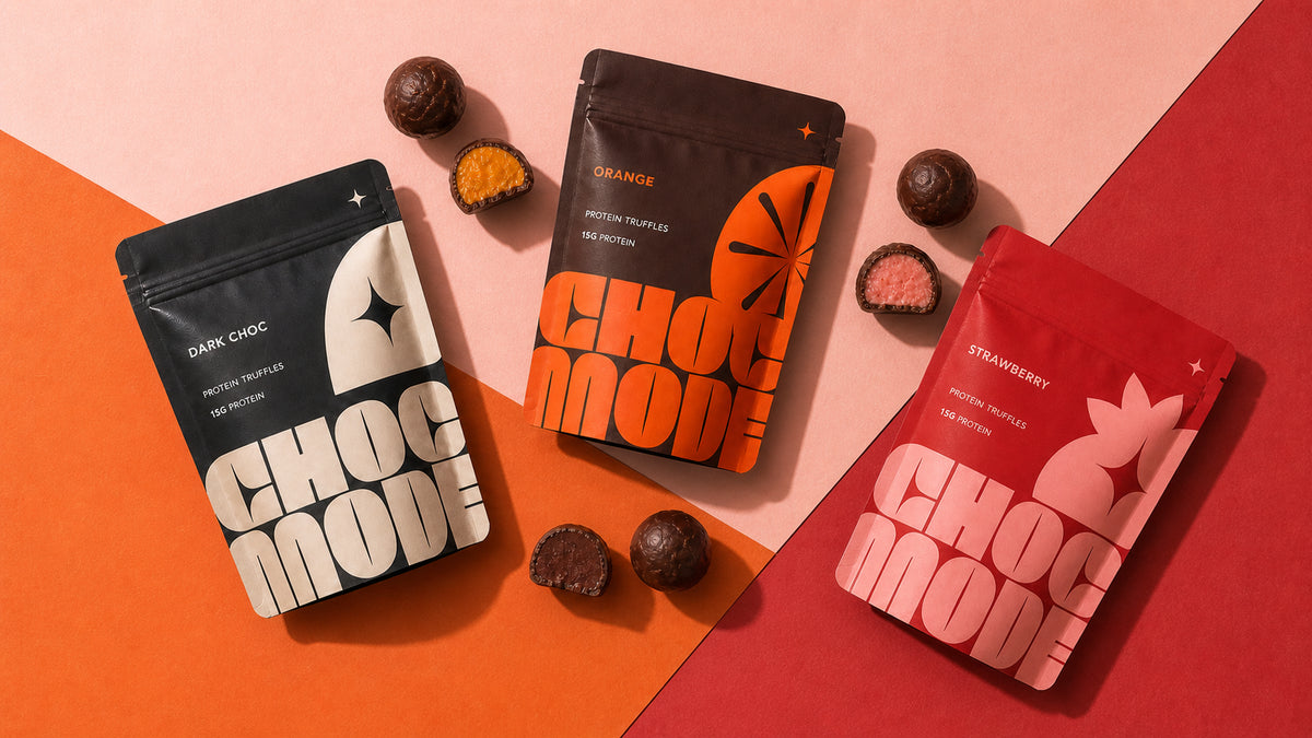
Brand Identity, Protein Snack Packaging, Multi-SKU Pouch Design, 3D Product Visuals for CHOC MODE, created in London, UK.
Category
Food
Scope
Brand Identity, Protein Snack Packaging, Multi-SKU Pouch Design, 3D Product Visuals
Focus
Protein snack packaging design
01
Project overview
A clear idea, brought to life with purpose.
02
About the project
Protein snack packaging design for CHOC MODE balances premium chocolate appeal with clear nutrition cues across three colour-coded truffle pouch variants.
03
The design response
CHOC MODE looks like a design-led chocolate brand while retaining the hierarchy required for a protein snack. Oversized lettering, sharp crops and concise descriptors give the compact pouch a memorable identity without relying on conventional fitness imagery.
Shared proportions, typography and information zones connect every SKU, while dark cocoa, orange and red-pink distinguish the flavours. Range packshots, close material views and editorial truffle scenes help decision-makers assess both the practical packaging system and its campaign potential.
Design priorities
Built to stand out. Structured to stay clear.
01
Distinctive identity
Build a recognisable visual idea that gives the project its own clear point of view.
02
Clear communication
Organise the message so the audience can understand the product quickly and confidently.
03
Designed for context
Create a flexible system that stays coherent wherever the brand needs to appear.
01/03
Swipe
Design priority 1 of 3
Creative direction
A distinctive idea designed to work everywhere.
Chocolate drama is balanced by modern discipline.
Oversized retro-futurist lettering, sharp crop points and small star motifs create a confident fashion-editorial mood. On the compact pouch, typography becomes the main brand asset, allowing the product to communicate function without defaulting to a clinical supplement or fitness aesthetic.
Dark cocoa anchors the core product, orange identifies the citrus variant and saturated red-pink signals strawberry. Cream fields, deep brown type and a shared hierarchy keep the range coherent, while concise descriptors make the nutritional role easy to find.
Sculptural pedestals, directional light, hard shadows and broken truffles turn the packaging into an appetite-led campaign world rather than a sterile product display.
Featured scope
The work behind the project.
↗
SELF-INITIATED CONCEPT
↗
BRANDING
↗
PACKAGING
↗
3D VISUALS
Created for CHOC MODE in London, UK. Designed by Tony Musso.
Project questions
Frequently asked questions
Practical details about CHOC MODE Protein Snack Packaging Design, the design scope and working with YNOT TONY on a related project.
What is the CHOC MODE Protein Snack Packaging Design case study?
The CHOC MODE Protein Snack Packaging Design case study presents Brand Identity, Protein Snack Packaging, Multi-SKU Pouch Design, 3D Product Visuals created for CHOC MODE in London, UK. It records the project scope, creative direction and selected visual outcomes.
What type of design project was created for CHOC MODE?
CHOC MODE Protein Snack Packaging Design is recorded as a SELF-INITIATED CONCEPT | BRANDING | PACKAGING | 3D VISUALS project. The documented scope is Brand Identity, Protein Snack Packaging, Multi-SKU Pouch Design, 3D Product Visuals, brought together as a clear and coherent design system.
Who designed CHOC MODE Protein Snack Packaging Design?
CHOC MODE Protein Snack Packaging Design credits Tony Musso as the designer. The work is presented by YNOT TONY, a UK-based packaging, brand and graphic design studio led by Tony Musso.
Which design services were included in CHOC MODE Protein Snack Packaging Design?
The recorded services for CHOC MODE Protein Snack Packaging Design are Brand Identity, Protein Snack Packaging, Multi-SKU Pouch Design, 3D Product Visuals. The case study shows how these elements work together to create one recognisable visual direction.
Can YNOT TONY create a similar food design project remotely?
Yes. YNOT TONY is a UK-based packaging, brand and graphic designer with more than 20 years of experience, available for remote projects across the UK, Europe, the USA, Australia and worldwide. A brief can begin with the product, audience, format, SKU count, timing and production requirements.
Where was the CHOC MODE Protein Snack Packaging Design client based?
The location recorded for CHOC MODE Protein Snack Packaging Design is London, UK. YNOT TONY also works remotely with clients in the UK and internationally.
Planning a food design project?
Let’s make the next one unmistakable.
Launching a functional food that still needs to feel desirable? Let’s create packaging that leads with appetite, communicates the nutritional story clearly and gives every flavour a recognisable place in the range.