Case study / Metabolic Health

Sigrid Therapeutics

Label Structure and Artwork Adaptation, 3D Bottle Rendering, Product Composition, Editorial Art Direction for Sigrid Therapeutics, created in Sweden / United States.

Category
Metabolic Health
Scope
Label Structure and Artwork Adaptation, 3D Bottle Rendering, Product Composition, Editorial Art Direction
Focus
Supplement label structure
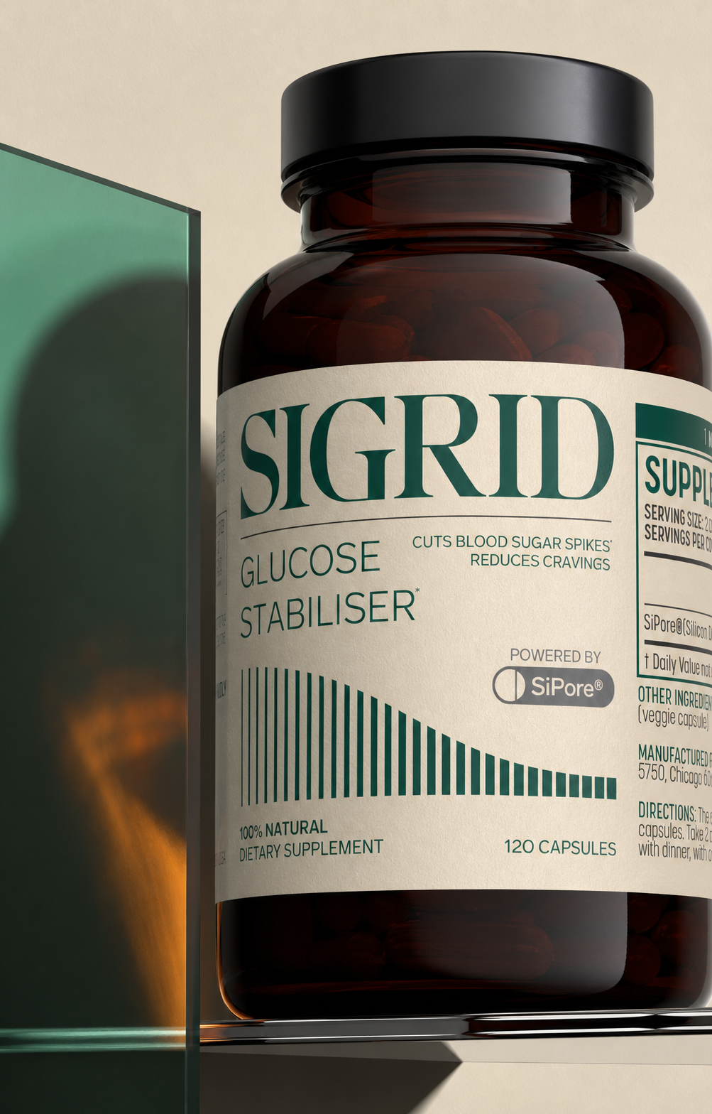
Extreme close-up 3D rendering of the SIGRID Glucose Stabiliser amber supplement bottle with ivory label and deep green typography

A clear idea, brought to life with purpose.

01

About the project

Role and attribution

The SIGRID brand identity and original graphic design were supplied. My role was deliberately focused on structuring the existing label content around the cylindrical bottle, adapting the approved artwork for a realistic pack, building the amber bottle in 3D, rendering its materials and directing the final product compositions.

This case study does not claim authorship of the SIGRID name, logo, typography or original visual identity. It documents label architecture, 3D product visualisation and art direction: the practical work that turns approved brand assets into a believable, commercially useful packaging system.

A science-first product context

Sigrid Therapeutics was founded in Sweden in 2014 by Sana Alajmovic and Professor Tore Bengtsson around years of metabolic-health research. The Glucose Stabiliser bottle had to communicate within that rigorous life-science context while still feeling relevant to a contemporary, consumer-facing wellness audience.

The challenge was not to reinvent the identity. It was to make dense approved information work around a compact amber bottle and then present the result with the clarity, authority and desirability expected from a premium health product.

02

The design response

A label system designed to work on the objectThe completed label structure gives approved content a clear route around the bottle. The front panel holds recognition and product identification, the graph supports a distinctive visual rhythm, and the side zones carry detailed information without disrupting the hero view.The multi-market renders demonstrate how the same structural logic can support English and Swedish applications while preserving the supplied visual identity.A reusable 3D presentation systemThe bottle was developed as a flexible product-visualisation asset...

Built to stand out. Structured to stay clear.

  1. 01

    Distinctive identity

    Build a recognisable visual idea that gives the project its own clear point of view.

  2. 02

    Clear communication

    Organise the message so the audience can understand the product quickly and confidently.

  3. 03

    Designed for context

    Create a flexible system that stays coherent wherever the brand needs to appear.

A distinctive idea designed to work everywhere.

Building a usable cylindrical label structure

A wrap label never appears to the customer as a flat rectangle. The front-facing zone, shoulder transition, edge curvature and side panels all change how information is read. The structure was mapped so the SIGRID wordmark, product name and descending graph remain dominant while supplement facts, ingredients, directions, warnings and barcode information continue naturally around the bottle.

Safe areas, the wrap seam and the relationship between the hero panel and regulatory copy were treated as production decisions rather than decorative choices. English and Swedish applications use the same underlying architecture, helping the pack remain recognisable across markets.

Material realism before visual drama

The 3D bottle system was built around a short, wide amber container with rounded shoulders, a broad matte-black cap, visible capsules and a warm ivory paper label. Glass absorption, capsule depth, label fibre, cap texture and controlled reflections were tuned so the pack could withstand both full-product views and extreme close-ups.

That accuracy matters because premium composition only works when the object itself feels convincing. The strongest frames deliberately enlarge the bottle beyond normal packshot scale, allowing amber glass, paper grain and the green typographic system to behave like fashion materials rather than standard supplement components.

Clinical precision with fashion confidence

The visual direction combines warm ivory, deep petrol green, brushed aluminium, optical glass and smoked amber. Hard light and architectural shadows bring scientific precision; severe cropping, direct flash and monumental scale bring the energy of an independent fashion magazine.

A woman-led editorial scene extends the product into a confident founder environment without presenting the model as a named individual or depicting product consumption. The result feels intelligent, modern and premium without falling into generic laboratory imagery.

The work behind the project.

  • CLIENT PROJECT
  • LABEL STRUCTURE
  • 3D PRODUCT RENDERING
  • ART DIRECTION

Created for Sigrid Therapeutics in Sweden / United States. Designed by Tony Musso.

Let’s make the next one unmistakable.

The label was not mine to redesign; the value of the project was making an existing identity work convincingly on a difficult physical object. Structure gave the information control, 3D gave the bottle credibility, and composition gave the science desire. That combination is often the difference between approved artwork and a product that feels ready for market.

Get a design quote